Introduction
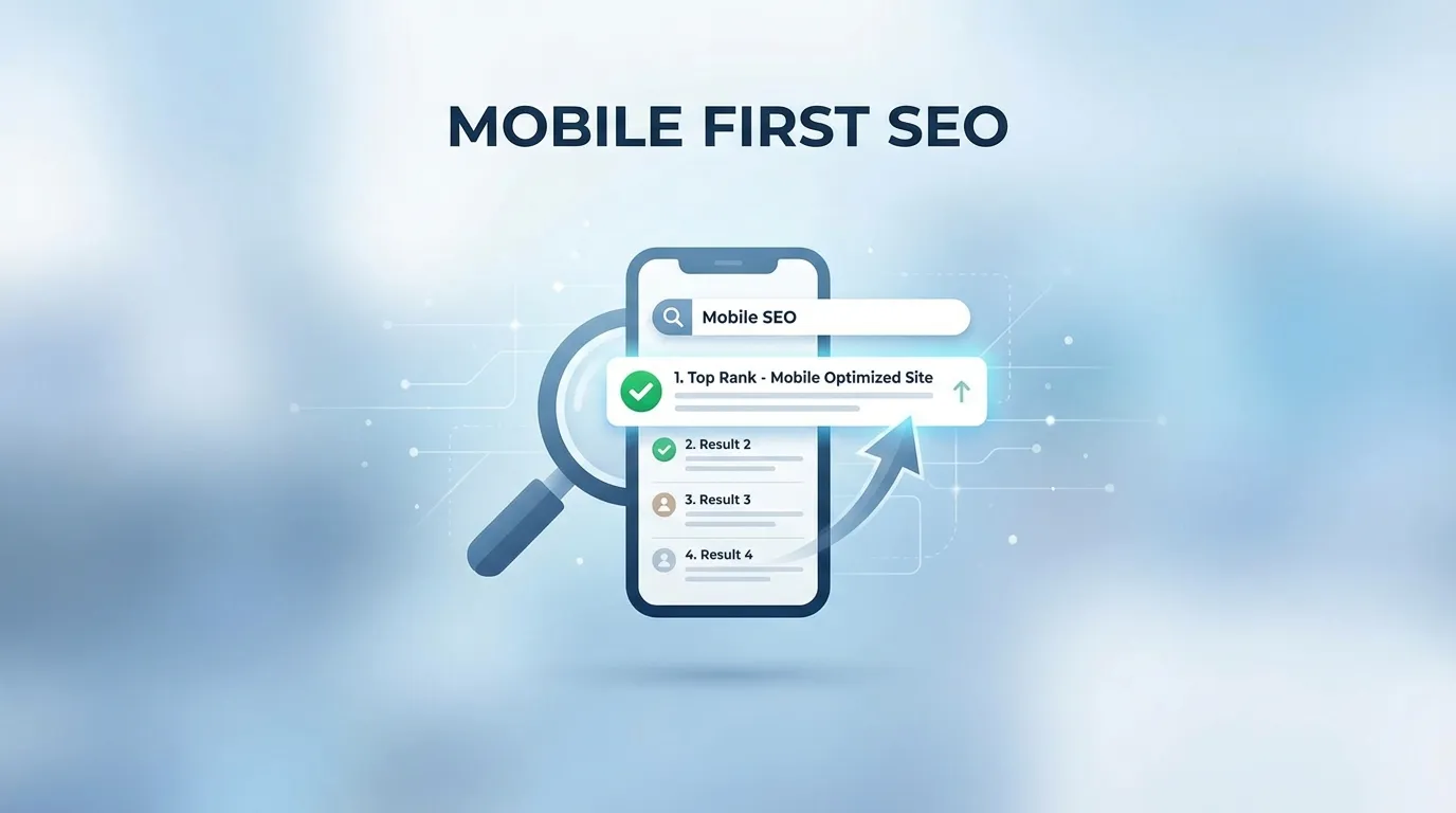
In the rapidly evolving landscape of 2026, the term "Mobile SEO" is no longer a separate, secondary sub-discipline of search engine optimization. It is SEO. As of late 2023, Google officially completed its multi-year transition to "Mobile-First Indexing" across the entire global web. This means that for every single one of the billions of websites currently in existence, Google’s primary ranking algorithm now exclusively uses the mobile version of the content to determine how a site should rank—even if the person searching is sitting in at a multi-monitor desktop workstation. This is the era of SEO for Mobile First Indexing Explained.
The shift to mobile-first indexing represents the most significant change in search crawler behavior in the history of the internet. It is a fundamental "Recalculation" of how domain authority, content relevance, and technical stability are measured. If your website is technically brilliant on a desktop but fails to provide a fast, identical, and fully interactive experience on a six-inch smartphone screen, your organic visibility will inevitably evaporate.
In this exhaustive 2,500+ word definitive guide, we are going to look at exactly how to survive and thrive in this mobile-only paradigm. We will discuss the critical importance of "Technical Content Parity," the updated rules for mobile Core Web Vitals, and how to identify "Hidden" mobile-only crawl errors that might be killing your rankings. By the end of this read, you will have the knowledge to turn your mobile site into a high-authority ranking machine, capturing the billions of searches conducted on-the-go every single day.
Why You Must Understand SEO for Mobile First Indexing Explained
The motivation behind Google’s move to mobile-first indexing was simple: The majority of the world’s internet users now access the web via mobile devices. Google’s business model depends entirely on providing a high-quality experience for the majority of its users. If their search engine recommended a site that looked great on a desktop but was broken on a mobile phone, users would eventually stop using Google.
By shifting their "Primary Indexer" to a mobile-simulated bot, Google is essentially forcing the world's web developers to prioritize the mobile experience. Understanding SEO for Mobile First Indexing Explained is no longer just about "Passing the Test"; it is about building a business that is compatible with the way the modern world actually consumes information.
Phase 1: The Concept of "Content Parity" (The #1 Mobile Ranking Killer)
The biggest mistake site owners make is the "Mobile Lite" approach. Years ago, developers would hide large chunks of text or specific images on mobile to "Save Space" or "Improve Speed." In a mobile-first world, this is a catastrophic SEO error.
Why Parity is Non-Negotiable
If you have 2,000 words of deeply researched content on your desktop version, but you only show a "Summary" of 500 words on your mobile version, Google will only rank you for the 500 words. The 1,500 hidden words functionally do not exist in the eyes of the search algorithm.
- Actionable Step: Every single paragraph of text, every high-quality image, and every structural header (H1-H4) must be identical between the desktop and mobile versions.
- The "Expandable" Workaround: Google has officially stated that content hidden behind "Tabs," "Accordion Menus," or "Read More" buttons is absolutely fine for mobile users, provided it is still physically present in the DOM (the source code). This allows you to maintain a clean mobile design without sacrificing your ranking potential.
Phase 2: Metadata and Technical Code Parity
It isn't just the visible text that counts. The "Invisible" code beneath your site must also be perfectly aligned across all device viewports.
1. Title Tags and Meta Descriptions
Many legacy WordPress plugins allow for different meta descriptions for mobile. Ensure your primary SEO metadata is identical. If your desktop title tag is highly optimized with high-intent keywords, but your mobile title tag is a generic shortened version, you will lose the ranking authority associated with those keywords.
2. Structured Data (Schema Markup)
This is a massive point of failure for large enterprise sites. Developers often optimize their product schema or review schema for the desktop version but "Disable" it on the mobile stylesheet to reduce the HTML file size.
- The Result: Google will likely fail to award you "Rich Results" (like those high-CTR review stars) because their mobile-first bot cannot find the markup.
3. Hreflang and Social Tags
If you are an international brand, your Hreflang tags (which tell Google which language to show which user) must be present on the mobile version. Similarly, Open Graph tags (for Facebook/LinkedIn previews) must be verified on the mobile-rendered DOM.
Phase 3: Mastering the Mobile User Experience (Core Web Vitals)
Since site speed is a confirmed ranking signal, and Google’s ranking bot is a mobile bot, your site’s speed on a 4G or 5G mobile connection is the only speed that truly impacts your SEO.
1. Crushing the "Largest Contentful Paint" (LCP)
LCP measures how fast your main content loads. On mobile, this is often a struggle because of "Render-Blocking" assets.
- The Fix: Use "Inline CSS" for everything above the fold. This allows the text to appear instantly without waiting for a massive external
.cssfile to download across a cellular network.
2. The Danger of Layout Shifts (CLS)
Mobile users are incredibly sensitive to "Jumpy" pages. If an ad banner pops into existence and pushes the text down while a user is reading, your CLS score will skyrocket.
- The Fix: Always reserve space for images and ads by declaring their
widthandheightin the CSS. This prevents the browser from having to "Recalculate" the layout as assets arrive.
3. Responsive Web Design (RWD) vs. m.dot Sites
While Google can index "m.example.com" sites, they strongly recommend "Responsive Web Design" where a single URL serves the same code to everyone, just with a different visual layout.
- The SEO Advantage: With RWD, you don't have to manage complex "Vary: User-Agent" server headers or redundant canonical tags pointing between your desktop and mobile subdomains. It is the cleanest, most "Future-Proof" way to execute SEO for Mobile First Indexing Explained.
Phase 4: Navigational Challenges on the Small Screen
On a 24-inch monitor, you have plenty of room for a massive "Mega Menu" with 50 links. On a smartphone, you have a 3-inch top bar.
Avoid the "Link Depth" Trap
Googlebot uses your internal links to determine which pages are most important. If you hide your "Important Pages" deep inside a hamburger menu that is only accessible via three clicks, Google might evaluate those pages as having "Low Importance."
- The Strategy: Use "Breadcrumbs" that are visible even on mobile. Breadcrumbs provide a clear hierarchical path for both the user and the search crawler to follow, ensuring that authority flows efficiently throughout your entire site.
Phase 5: Troubleshooting Mobile Crawl Errors via Google Search Console
Even the most beautiful site can have hidden technical flaws that only appear to a bot.
- The "Mobile Usability" Report: This is your early warning system. It will tell you if your text is "Too small to read," if your "Clickable elements are too close together," or if the "Content is wider than the screen." If you have errors here, you are failing the mobile-first test.
- The URL Inspection Tool: When you publish a new page, immediately use the URL Inspection tool and select "Test Live URL." Look at the "Screenshot" tab. Is the bot seeing what you are seeing? Is a rogue JavaScript pop-up or a cookie consent banner blocking the hero image? If the bot sees a blank white screen, it will index a blank white screen.