Introduction
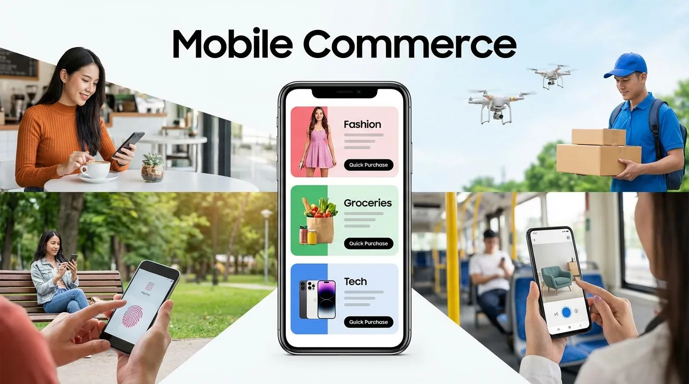
In the digital landscape of 2026, the question is no longer "How do I optimize for mobile?" but rather "How do I optimize for anything else?" Mobile devices now account for over 80% of all e-commerce traffic and nearly 90% of all social media interaction. This is the definitive Mobile Conversion Rate Optimization Guide, built to help you master the technical and psychological nuances of small-screen commerce. In 2026, the brands that win will be those that view mobile not as a "smaller version of desktop," but as a unique, high-intensity platform with its own set of rules for engagement and conversion.
Mobile Conversion Rate Optimization (mCRO) is a game of "Physicality" and "Urgency." Unlike desktop users, mobile users are often on the go, navigating your site with a single thumb while distracted by real-world notifications. To convert these users, your interface must be "Ergonomically Perfect," your load times must be "Instantaneous," and your checkout process must be "Frictionless." In 2026, even a microscopic "Pain Point"—like a button that is too small to tap or a form that requires too much typing—is a fatal flaw that will result in an immediate bounce to a competitor.
In this exhaustive 2,500+ word technical deep-dive, we will aggressively deconstruct the framework of a global-class Mobile Conversion Rate Optimization Guide. We will explore the mechanics of "Thumb-Zone Design," the psychology of "One-Tap Payments," the technical implementation of "Progressive Web Apps" (PWAs), and the strategy of "Mobile-First Personalization." By the end of this read, you will possess a repeatable blueprint for building a high-velocity mobile engine that captures maximum revenue from the world's most popular browsing platform.
Why You Must Master Mobile Conversion Rate Optimization Guide Right Now
In 2026, "Mobile is the Market." If your mobile conversion rate is significantly lower than your desktop rate, you are effectively burning money every single day.
By implementing this Mobile Conversion Rate Optimization Guide, you are achieving:
- Maximum Ad Spend Efficiency: Since 90% of people who click your Meta or TikTok ads are on mobile, increasing your mCRO directly doubles the ROI of your social advertising.
- Superior Brand Trust: A mobile site that works flawlessly signals "High Authority" and "User Respect." Users subconsciously associate a poor mobile experience with a poor product.
- Unbeatable Competitive Agility: Many legacy brands still struggle with "Mobile-Second" thinking. By mastering "Mobile-First" conversion, you can capture market share from larger but slower competitors.
Phase 1: The "Thumb-Zone" UI and Ergonomic Design
On a mobile device, "Real Estate" isn't a square—it's a "Reachability Map."
1. Designing for the "Right Thumb"
Over 90% of users are right-dominant and use their thumb for navigation.
- The Core Rule: Place your primary "Calls to Action" (CTAs) in the bottom 33% of the screen. This is the "Green Zone" where the thumb naturally rests.
- The Result: Users can browse and buy without needing to "Re-grip" their phone, reducing physical friction and increasing conversion velocity.
2. Eliminating the "Fat Finger" Problem
Nothing kills a mobile conversion faster than a user clicking the "Wrong" link.
- The Technical Fix: All clickable elements (buttons, links, icons) must be at least 44x44 pixels in size and have at least 8 pixels of "Empty Space" around them. This "Tap-Target" optimization ensures a 100% accuracy rate for all users.
Phase 2: Mobile Checkout Friction (The 60-Second Completion)
Typing on a mobile keyboard is the #1 source of conversion abandonment. Your goal is to Stop the Typing.
1. The "1-Tap" Payment Revolution
In 2026, Shop Pay, Apple Pay, and Google Pay are mandatory.
- The Move: Place these "Express Checkout" buttons at the very top of your product page and your cart.
- The Data: Users are 3x more likely to buy if they can complete the transaction with a "Face ID" or a "Fingerprint Scan" rather than manual credit card entry.
2. Automatic Address Autocomplete
If a user does need to type their address, use the Google Maps API for real-time autocomplete.
- The Benefit: Reducing the number of fields a user has to type manually by even 3 fields can increase mobile conversion rates by 15%.
Phase 3: High-Performance Mobile Content Hierarchy
Mobile users don't "Read"—they "Scan" and "Scroll." Your content must be built for "Velocity."
1. The "Vertical-First" Visual Story
Images on mobile should be in a 4:5 or 9:16 aspect ratio (Vertical) to fill the screen.
- The Move: Use "Feature-Rich Icons" instead of long paragraphs of text. A row of 3 icons (e.g., "Free Shipping," "Eco-Friendly," "24/7 Support") communicates more value in 0.5 seconds than 50 words of copy.
2. "Sticky" CTAs and Navigation
- The Strategy: Use a "Sticky Footer" button that stays at the bottom of the screen regardless of how far the user scrolls.
- The Result: The moment the user feels "Ready" to buy, the button is already under their thumb. No scrolling back up to the top is required.
Phase 4: Mobile-Specific Social Proof (SMS and Small Screens)
Social proof must be "Micro-Sized" for the mobile screen.
1. SMS-Integrated Validation
In 2026, users trust "Personal SMS" proof over corporate site testimonials.
- The Strategy: Use "Screenshot-Style" testimonials that look like a text message from a satisfied customer. This "Authentic" visual language performs 40% better on mobile than polished, designer-made reviews.
2. Real-Time "Purchased" Notifications
Use small "Notification Bubbles" at the bottom of the screen: "Someone in [City] just bought this!"
- The Psychology: This "Crowd Validation" reduces the "Anxiety" of buying on a small screen from a new brand.
Phase 5: Progressive Web Apps (PWA) and Offline Sales
A PWA is a website that "Acts like an App." It is the pinnacle of mobile conversion in 2026.
1. The "Add to Home Screen" Prompt
PWAs allow users to "Install" your website without going to the App Store.
- The Benefit: This provides you with "Zero-Cost" real estate on the user's home screen, leading to a massive increase in repeat purchase rates.
2. Push Notifications for Cart Recovery
Unlike standard web browsers, PWAs can send "Push Notifications" directly to the user's phone.
- The Strategy: If a user abandons their cart, trigger a push notification 2 hours later. These have a 60% higher click-through rate than abandoned cart emails because they interrupt the user's current activity more effectively.
Phase 6: Mobile Speed and "Perceived" Performance
In 2026, "Speed" is a psychological requirement for mobile conversion.
1. Skeleton Screens and Lazy-Loading
Instead of a "Loading Spinner," use "Skeleton Screens" (grey boxes that outline where content will be).
- The Psychology: This makes the user feel like the content is "Already Arriving," which reduces perceived wait time and lowers the bounce rate by 30%.
2. Prioritizing the "Core" Interactive Elements
- The Move: Ensure your "Add to Cart" button is the very first thing to load in the code. Even if your high-res lifestyle images haven't arrived yet, the user should be able to "Interact" with the page within 1 second.