Introduction
Think about how users interact with your website today.
Most of them are not on desktops anymore. They are on:
- Smartphones
- Tablets
- Different screen sizes
- Different browsers
If your application breaks on mobile, you lose users instantly.
That is why playwright mobile testing is no longer optional. It is essential.
But here is the problem many testers face:
- Manual mobile testing is slow
- Device testing is expensive
- Inconsistent results across devices
This is where Playwright changes the game.
With Playwright, you can:
- Simulate real mobile devices
- Test responsive designs
- Automate gestures and touch events
- Run tests across multiple devices easily
In this guide, you will learn:
- What mobile testing in Playwright is
- Why it matters
- How to set up mobile testing step by step
- Real examples and best practices
- Common mistakes to avoid
By the end, you will be able to confidently automate mobile testing using Playwright like a professional.
Simple Explanation
Instead of using a real phone, Playwright lets you simulate devices like:
- iPhone
- Android phones
- Tablets
1 Mobile First World
Most traffic today comes from mobile users.
3 Faster Testing
No need for physical devices.
Playwright provides built in device descriptors.
What It Simulates
- Screen size
- Viewport
- User agent
- Touch support
Step 2 Import Devices
import { devices } from '@playwright test';
Step 4 Run Tests
npx playwright test
Why It Matters
Your website should adapt to different screen sizes.
What to Check
- Layout alignment
- Font sizes
- Button visibility
Example Tap Action
await page.tap('#menu button');
What to Test
- Hamburger menu
- Dropdown navigation
- Mobile headers
Cross Device Testing
Run Tests on Multiple Devices
projects: [
  { name: 'iPhone', use: { ...devices['iPhone 13'] } },
  { name: 'Android', use: { ...devices['Pixel 5'] } },
]
Real World Scenario
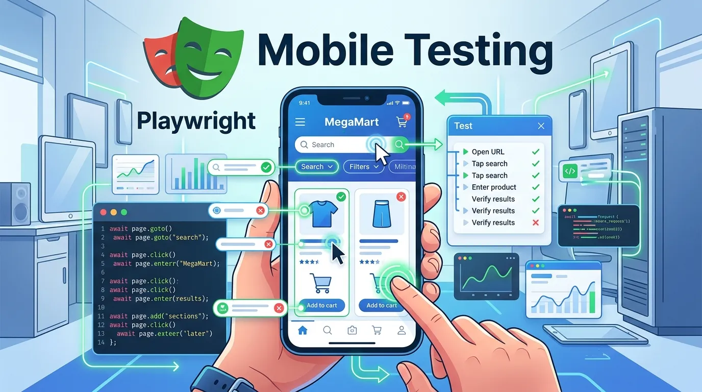
E Commerce Mobile Testing
You need to test:
- Product listing
- Add to cart
- Checkout
Best Practices for Playwright Mobile Testing
Test Real User Scenarios
Focus on actual user journeys.
Combine Desktop and Mobile Tests
Ensure full coverage.
Validate UI Carefully
Check:
- Alignment
- Visibility
- Responsiveness
Testing Only One Device
Limits coverage.
Overloading Tests
Keep tests focused and simple.
Advanced Mobile Testing Techniques
Network Throttling
Simulate slow networks.
Device Rotation
await page.setViewportSize({ width: 667, height: 375 });
Step by Step Action Plan
1 Set up Playwright
2 Configure mobile devices
3 Write mobile test cases
4 Run across devices
5 Validate UI and interactions
6 Integrate with CI CD
Short Summary
Playwright mobile testing helps you:
- Test mobile responsiveness
- Simulate real devices
- Automate mobile interactions
- Improve user experience
FAQs
What is playwright mobile testing
It is the process of testing web applications on mobile devices using Playwright.
Can I test multiple devices
Yes Playwright supports multiple device configurations.
Can I simulate touch actions
Yes Playwright supports tap scroll and gestures.


